
Travel Notes
A running record of where I go, what I notice, and how travel shapes my work. Each destination has its own intention — sometimes design-driven, sometimes personal — and every entry includes what I hoped to find and what I actually discovered.
These aren’t itineraries. They’re curated notes: the textures, places, colors, and experiences that stay with me, and how I fold them back into my life and my design practice.
Follow along on Instagram for real-time travel notes and design inspiration @jules.nolet
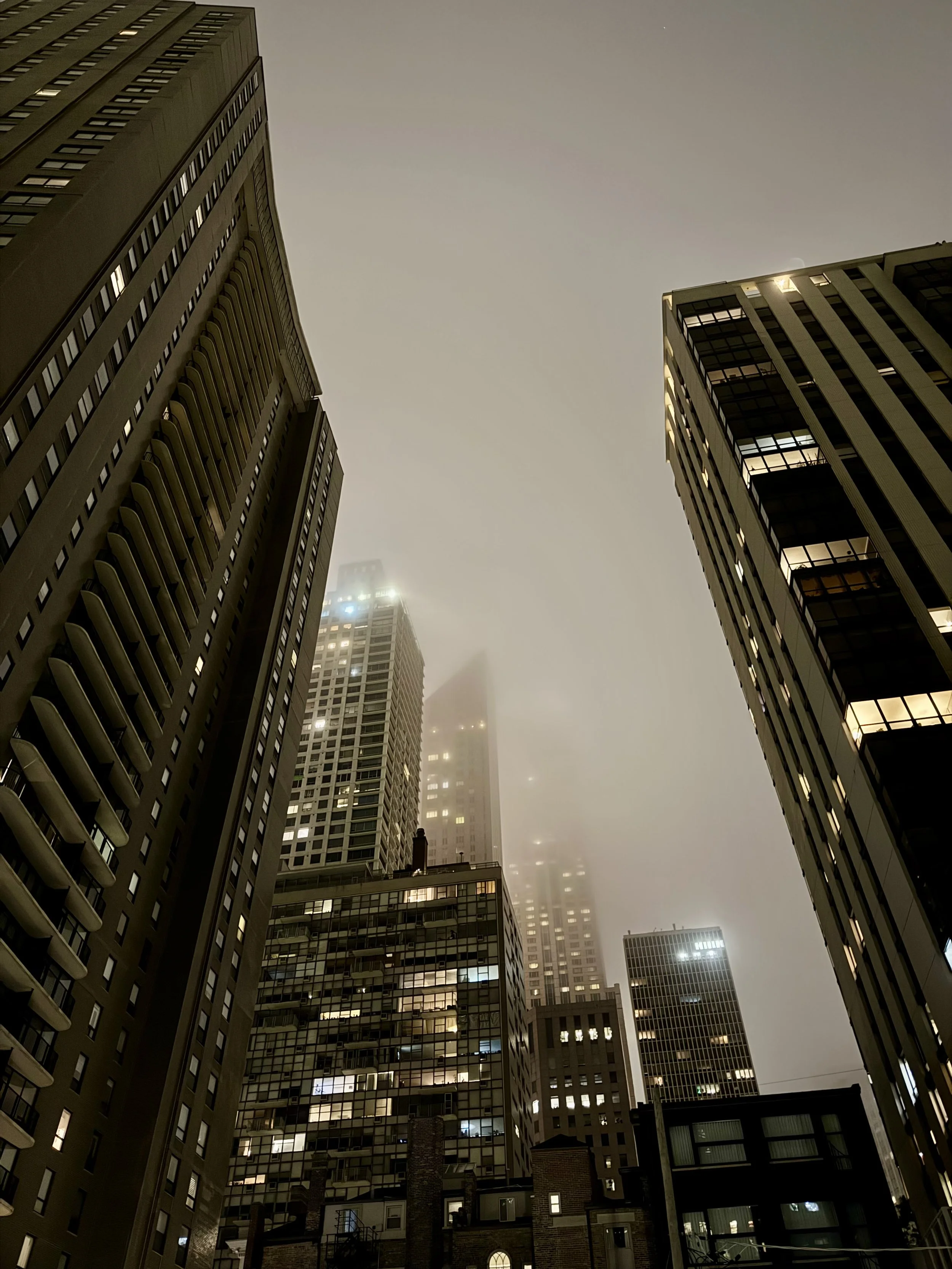
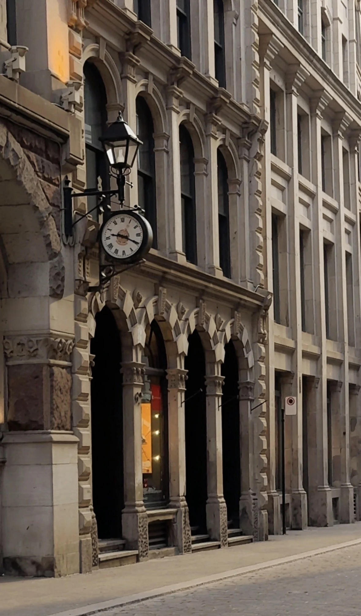
San Francisco 2026

-
San Francisco has been part of my life for decades, but I haven't spent meaningful time there in nearly five years.
It's interesting how often we reserve curiosity for faraway destinations while overlooking places that feel familiar. We assume they'll always be there, so we stop seeing them with fresh eyes.
As I celebrate another birthday, I'm returning to one of my old stomping grounds with a different perspective. I'm staying at The Battery, a private club I've long been curious about, and using the trip as an opportunity to experience the city more intentionally.
I'm interested in revisiting familiar neighborhoods, discovering places I've somehow missed over the years, and paying attention to what has changed, both in the city and in the way I experience it.
Sometimes the most meaningful travel isn't about going somewhere new. It's about returning to a place you thought you already knew and seeing it differently.
-
I expect San Francisco to feel both familiar and new.
I'm looking forward to revisiting neighborhoods I've loved for years while discovering places that have somehow escaped my attention. I'll be spending time exploring the city through the lens of design, hospitality, and everyday rituals, from a stay at The Battery to restaurants, architecture, and the details that give a city its character.
More than anything, I'm curious to see what stands out now that time has created a little distance. The places that continue to resonate after years away are often the ones that reveal the most.
-
Chicago 2026
-
I'm returning to Chicago two summers in a row, but this trip feels different.
Last summer’s visit was brief and centered around architecture, neighborhoods, and sourcing art for Cardiff project. Two pieces I purchased from Jack Flynn now hang in my home, becoming part of my daily life long after the trip ended.
This time, I'm interested in experiencing Chicago more deeply. I'll be exploring the city with an old friend who knows it intimately, which offers the opportunity to see beyond the landmarks and into the places, restaurants, and routines that define the city for the people who live there.
What continues to draw me to Chicago is its reputation for substance. It's a city celebrated for architecture, design, and hospitality, but also for its practicality and sense of permanence.
More than anything, I'm curious to see whether a second visit changes my understanding of the city and what new observations emerge when familiarity replaces novelty.
-
I expect Chicago to reveal itself differently this time.
I'm interested in looking beyond the architecture and paying closer attention to how people inhabit the city and how design influences everyday experience.
I'll be spending time in some of Chicago's most celebrated restaurants and hospitality spaces, observing not only what makes them beautiful, but what makes them memorable.
Most of all, I'm curious to see what stays with me after I leave—the places, details, and observations that continue to resonate long after the trip is over.
-
Puglia 2026
-
I’m going to Puglia because, despite having traveled extensively throughout Italy, it’s a region I’ve never experienced. It’s been on my list for a long time, largely because of its distinct architectural language and its more grounded, less polished feel compared to other parts of the country.
The trulli structures in particular have always stood out to me. Their form, material, and simplicity are unlike anything else in Italy, and I want to see how they exist within the broader landscape rather than as isolated images.
I’m also drawn to the coastline — towns like Polignano a Mare, where architecture meets the cliffs in a way that feels both dramatic and natural.
More than anything, this trip is about continuing to deepen my understanding of Italy — its design, its food, and the way each region expresses itself differently while still feeling cohesive.
-
I expect Puglia to feel more elemental than other parts of Italy. Less refined on the surface, but more grounded in material and tradition.
The architecture will likely read as simple but intentional. Whitewashed stone, thick walls, minimal ornamentation, and forms that are shaped more by necessity and climate than by style.
The landscape should play a stronger role here. Open, sun-washed, and directly connected to the architecture rather than separate from it. Coastal areas will bring a contrast between solid mass and open water.
I also expect a slower, less curated rhythm. Fewer highly polished moments, more authenticity in how spaces are used, how food is prepared, and how daily life unfolds.
I’m looking to see how restraint, material, and environment come together in a way that feels both humble and deeply considered.
-
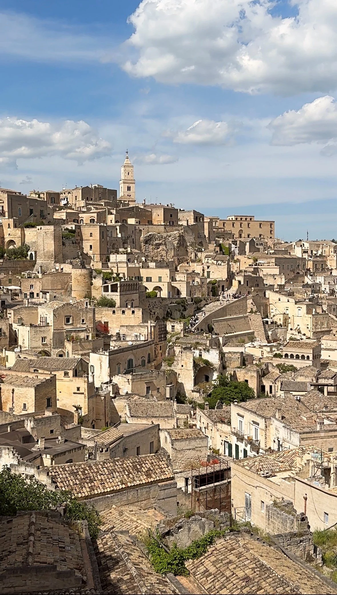
Puglia feels different from the parts of Italy that are more heavily traveled.
There’s less polish, less pressure to present itself. It doesn’t rely on designer storefronts or curated moments in the way places like the Amalfi Coast do. It feels more local, more lived in, and more grounded in its own rhythm.
Polignano a Mare was striking in a very immediate way. The cliffs, the water, the way the town sits right at the edge, it doesn’t need much beyond that. It’s dramatic, but not exaggerated.
Matera was something else entirely. I didn’t realize before arriving that scenes from No Time to Die were filmed there, but it made sense as soon as I saw it. The landscape has a scale and texture that feels almost cinematic on its own. Stone layered into stone, structures carved rather than built. It doesn’t feel decorative. It feels permanent.
What I found myself returning to most, though, were the smaller, everyday things.
The focaccia is nothing like what we call focaccia in the U.S. It’s soaked with olive oil, crisp at the edges, almost caramelized underneath. Studded with tomatoes or olives, or split and filled simply—octopus, ham, cheese. It doesn’t need anything else.
And taralli. Simple, crunchy, unassuming. Paired with olives and a glass of white wine, it becomes its own kind of ritual. Not styled, not elevated—just part of the day.
There’s a consistency in that.
Nothing feels like it’s trying to perform. It’s just there, doing what it’s meant to do.
Portugal 2026
-
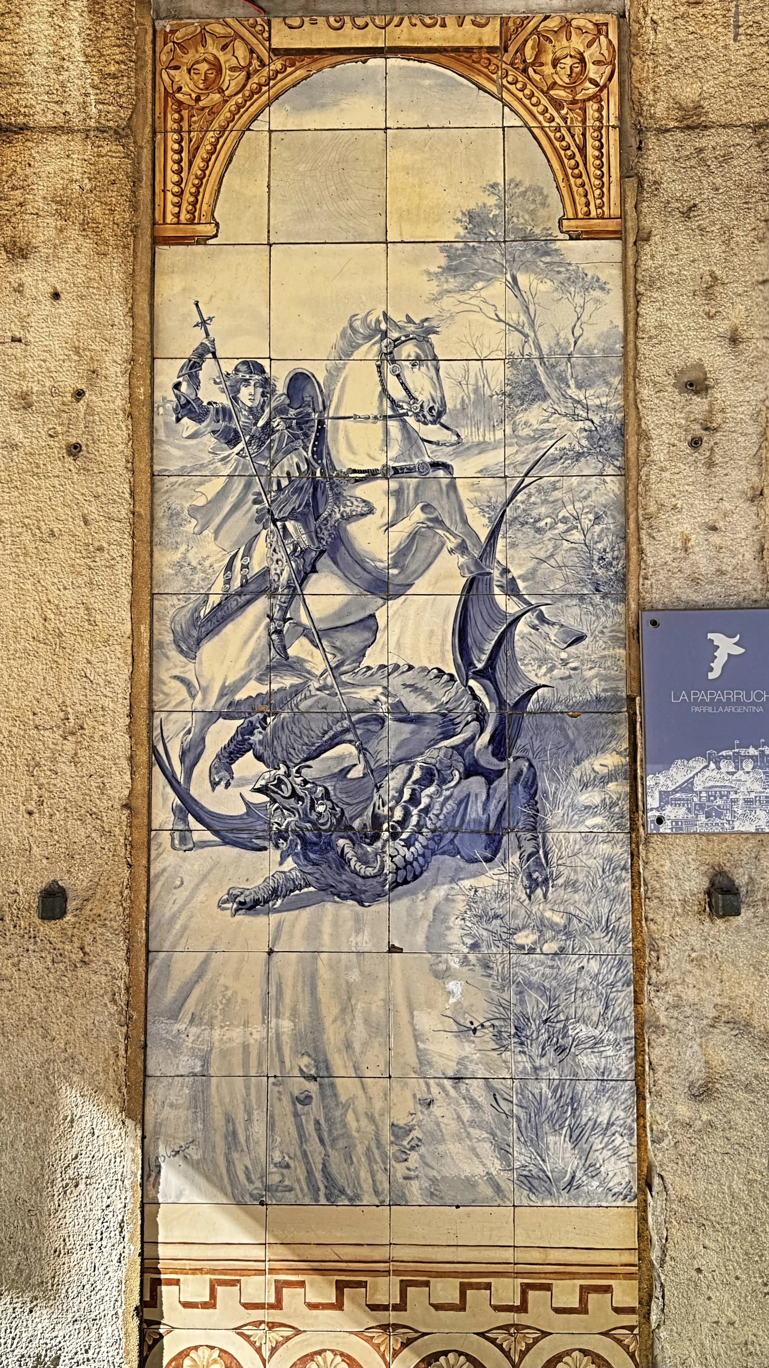
I’m going to Lisbon for a few specific reasons. It’s a city that sits at the intersection of history, craft, and a growing contemporary art scene, and I want to experience it before it shifts into peak season.
Timing matters here. By going ahead of the late May and early summer design and art events, I’m able to move through the city without the full international crowd. That means better access, more time, and a clearer read on what’s actually there without the overlay of an event-driven atmosphere.
I’m also going with intention to source. Portuguese tiles, antiques, and smaller artisanal pieces have a level of authenticity and material honesty that’s difficult to replicate elsewhere. I want to see what I can find firsthand rather than relying on secondary markets.
And then there’s the design perspective. Visiting Vermelho Hotel, Christian Louboutin’s hotel, is part of that. It’s a study in layered, expressive design rooted in local craftsmanship but interpreted through a very specific point of view.
-
I expect Lisbon to feel layered and textural, with a strong connection between architecture and material. Stone, plaster, tile, and patina that come from age and use rather than design intent alone.
There should be a noticeable contrast between the historic city and the evolving contemporary scene. Established institutions like MAAT and local galleries coexist with a newer wave of design and collectible craft that’s gaining international attention.
Given the timing, I expect a quieter version of the city. Less event-driven energy, more day-to-day rhythm. Shops, galleries, and restaurants operating in their normal state rather than at capacity.
I’m looking to understand what feels enduring here and what feels newly introduced, and how those two layers coexist without competing.
-
This trip didn’t reveal itself in the way I expected.
Portugal is quiet in its confidence. The spaces that stayed with me weren’t the most elaborate. Fewer materials. Softer transitions. Nothing trying too hard to impress.
You feel it immediately when something is done well there. It settles you instead of asking for attention.
What also stayed with me was the people. There’s a warmth that isn’t performative. Thoughtful, unhurried, and genuinely kind in a way that makes you feel taken care of without it being made a point.
It was also my first real exposure to Portuguese wine. I’ve always leaned toward French, Italian, and California, so I wasn’t expecting to notice it as much as I did. But what stood out was how drinkable it is. It’s not something you save. It’s poured without ceremony and becomes part of the day.
I found myself drawn to the ceramics as well. Not overly refined or precious. More grounded. Pieces meant to be used, not just displayed.
The climate and terrain felt familiar in a different way. Lisbon, with its hills, reminded me of San Francisco. The same movement through elevation, the shifting light, and those microclimates where the temperature changes from one neighborhood to the next. You can feel the coast without always seeing it.
Earlier in the trip, it was simple things that stayed with me. A plaster wall, worn tile underfoot, a room that didn’t need anything added to it. The same way the best meals didn’t feel staged, and the wine didn’t need to be explained.
The last part of the trip was the opposite. Delays, missed connections, lost luggage—by the end, everything was reduced to a small set of things: a carry-on, a phone, a place to sit, a place to sleep.
Portugal doesn’t ask for attention. It holds it without trying.
Coming home, I’ve been thinking less about adding and more about editing. What can be removed without losing what matters.
Because once things are reduced, what’s left is usually enough.
Montreal 2026
-
I’m going to Montreal for contrast. It’s a North American city with a distinctly European sensibility, and it has always had a strong pull for me. The architecture, the culture, the food, the overall ease of how the city lives.
I’m also choosing to go at the tail end of winter, which is not the typical time. I want to experience the city without the summer crowd and see how it feels when it’s quieter and more settled.
I’m going to take it in properly and see what actually holds up beyond reputation.
-
I expect Montreal to feel different from most North American cities. More layered. More walkable. A stronger sense of history in the architecture and the streets.
There should be a clear European influence in scale and material. Stone buildings, older facades, proportions that feel considered rather than oversized.
Given the timing, I expect it to be quieter. Fewer people, less pressure, and more room to move through the city at a natural pace. Restaurants, galleries, and cafés should feel more personal and less transactional.
-
Going at the tail end of winter ended up being the right call. Without the summer volume, the city felt more accessible and easier to move through.
What stood out most was the level of attention. Restaurants felt considered. Galleries were calm enough to spend real time in. Nothing felt rushed or overrun.
Montreal feels accumulated rather than designed. Layered over time through use, culture, and history. That’s what gives it depth. It doesn’t try to impress, it just holds its standard.
Since returning, I’ve been thinking more about how to create spaces that feel the same way. Composed, but lived-in. Refined, but not formal.
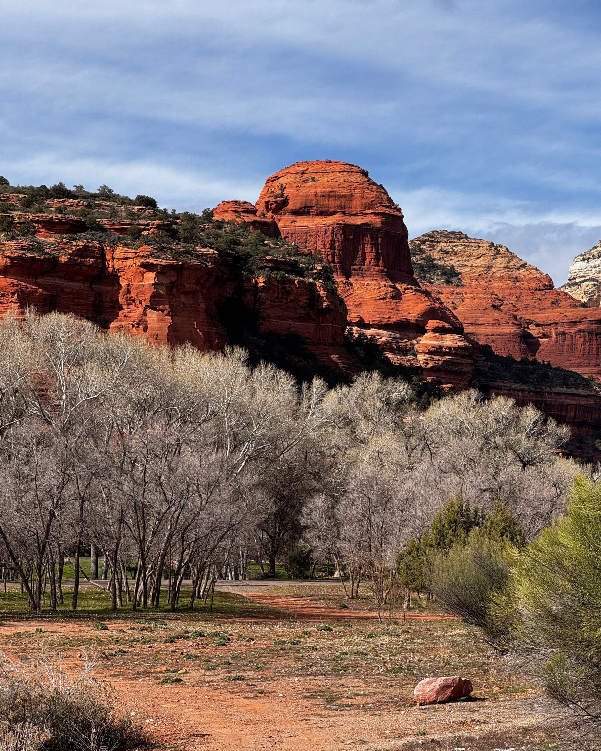
Sedona 2026
-
I’m going to Sedona for recalibration and perspective. When life or work reaches a point where clarity matters more than momentum, Sedona has consistently been a place I return to.
This trip is about creating space, mentally and physically, for reflection and realignment. Time at Mii Amo is an intentional part of that process, offering structured stillness and ritual within a powerful natural setting.
-
Sedona is expansive and elemental. Red rock formations, wide skies, and shifting light establish a sense of scale that immediately puts things into proportion. The landscape is visually dramatic, but its effect is grounding rather than activating.
At Mii Amo, the experience is quiet and inward-focused — guided by rhythm, repetition, and containment. Mornings are slow. The environment is steady and uncompromising. Nothing is decorative. Everything has purpose. Days unfold slowly. Mornings are quiet. The environment is steady and uncompromising — nothing ornamental, nothing performative. It’s a place where nature sets the pace and everything else falls into proportion.
-
Sedona once again delivered clarity through stillness. The combination of vast landscape and intentional retreat collapsed urgency quickly and restored a natural hierarchy — what matters rose to the surface without effort.
Despite the dramatic surroundings, the internal effect was centering. The power of the place isn’t expressive or symbolic; it’s steady and resolute. There’s no narrative to interpret — just presence.
After returning, I noticed a calmer confidence in my thinking and a stronger trust in instinct over over-analysis. Creatively, Sedona reinforced the value of restraint — letting space, proportion, and alignment do more of the work.
Sedona doesn’t push. It holds. And in that containment, clarity returns.
What I Brought Home (Design + Energy Notes)
Scale awareness — letting proportion and negative space lead.
Structured stillness — rhythm and ritual as design principles.
Visual calm — reduction without loss of presence.
Perspective — decisions made from alignment, not momentum.
Trust — allowing instinct to guide once structure is sound.
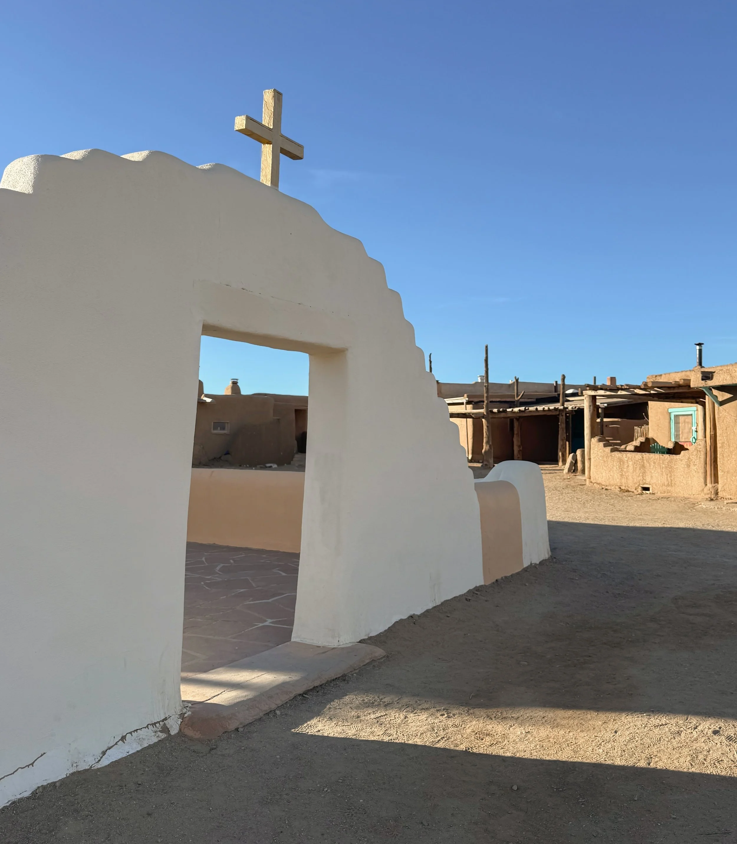
Santa Fe 2025
-
I’m going to Santa Fe for grounding and recalibration during a period of transition — personally and creatively. I’m drawn to its age, its restraint, and its sense of permanence. This is not a trip for stimulation or novelty, but for stillness, clarity, and depth.
I’m seeking an environment that holds weight — materially and energetically — where architecture is shaped by climate, history, and necessity rather than trend. I want to observe how quiet power expresses itself through form, texture, and proportion.
-
Santa Fe operates at a slower, more deliberate pace. Thick adobe walls, mineral-rich palettes, hand-worked materials, and architecture rooted in place rather than performance. Light is softer but more intentional. Ornament is symbolic, not decorative.
The atmosphere is contemplative and contained — spaces that feel protective, grounded, and deeply connected to the land. It’s a place that encourages attention rather than distraction.
-
Santa Fe proved to be energetically powerful — not in a loud or expressive way, but in its stillness. The quiet wasn’t passive; it was steady, ancient, and grounding in a way that settles the nervous system and sharpens perception.
What stayed with me most was the sense of permanence. Adobe structures, layered patina, and restrained detailing convey authority without assertion. Nothing asks to be noticed, yet everything holds presence.
Since returning, I’ve felt a stronger pull toward designs that emphasize weight, continuity, and containment — spaces that feel anchored and protective, allowing calm and confidence to emerge naturally through material honesty and proportion rather than excess.
Santa Fe didn’t introduce new ideas. It confirmed a deeper alignment.
What I Brought Home (Design + Energy Notes)
Material weight — adobe, plaster, clay, stone, wood. Substantial, honest, enduring.
Grounded palettes — mineral reds, soft charcoals, sun-washed whites, warm earth tones.
Intentional restraint — ornament used sparingly and meaningfully.
Containment — spaces that hold you rather than flow endlessly.
Quiet authority — confidence expressed through age, thickness, and proportion.

Vietnam 2025
-
I’m returning to Vietnam to experience it as an adult — with discernment, context, and a trained eye. I was born there, fluent in the language, and haven’t been back in over twenty-five years. This trip is both personal and observational.
I’m going for reconnection, but also for clarity — to see the culture, craftsmanship, and everyday beauty not through memory, but through experience. Attending a close friend’s wedding provides a meaningful anchor, but the larger intention is immersion: food, markets, coastlines, and the material language of daily life.
-
Vietnam is warm in every sense — climate, hospitality, and human exchange. Markets are layered and vibrant. Color is everywhere, but never chaotic. Food is deeply thoughtful: fresh, balanced, and intuitive.
I expect coastal softness alongside urban density, artisanal traditions that remain alive and functional, and a culture where beauty is woven into the everyday — silk, woven hats, ao dài, ceramics — not curated, but lived.
This is a place where design is inseparable from use.
-
Vietnam felt both familiar and newly revealed. Experiencing it as an adult — fluent, present, and observant — brought a level of depth I couldn’t have accessed before.
What stayed with me most was the confidence of craftsmanship. Materials are handled with ease and respect. Color is bold yet balanced. Nothing feels precious, yet everything is considered. Beauty exists in motion — in markets, meals, streets, and daily rituals.
Returning shifted my relationship to contrast in design. Vietnam reinforced that restraint and richness are not opposites — they’re complements. When structure is strong, color and texture can be expressive without overwhelming.
This trip didn’t just expand my perspective. It reconnected me to it.
What I Brought Home (Design + Energy Notes)
Color confidence — vibrant hues grounded by natural materials.
Artisanal detail — silk, woven fibers, ceramics, handwork with purpose.
Everyday beauty — design that supports life, not display.
Hospitality as design — spaces shaped around gathering, food, and warmth.
Cultural continuity — tradition evolving naturally, not preserved behind glass.

Palm Springs 2025
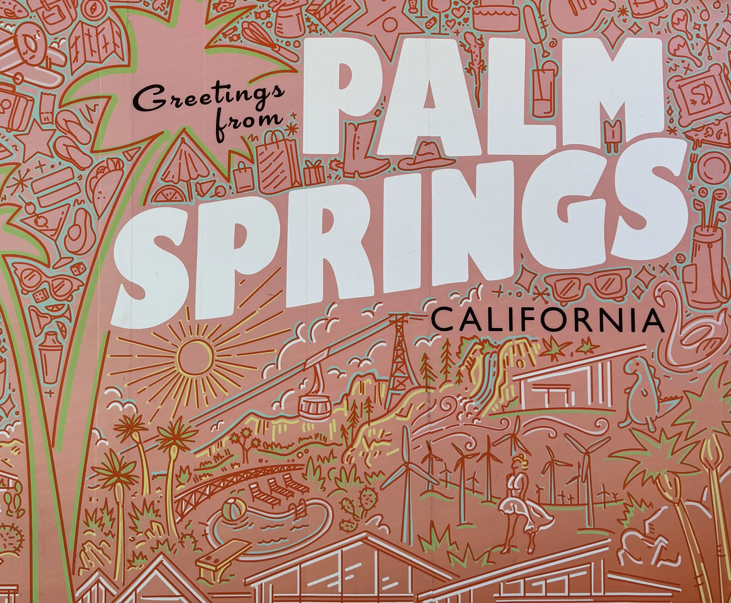
-
I’m going to Palm Springs for restoration after completing an intense residential project in Cardiff. This trip is a deliberate pause — a way to mark the close of a demanding creative chapter before beginning the next.
I’m seeking warmth, simplicity, and quiet rhythm. Desert environments tend to strip things back quickly, which helps me recalibrate both physically and creatively.
-
Palm Springs in shoulder season offers clarity: warm days, cool nights, and an unhurried pace. At Two Bunch Palms, historic adobe structures are paired with restrained modern updates — plaster, teak soaking tubs, natural stone, water features, and shaded paths.
The experience is designed around stillness and repetition. Long soaks. Early mornings. Minimal stimulation. A setting that encourages the nervous system to settle and perspective to reset.
-
Palm Springs reinforced the value of restraint. Reduced palettes, strong silhouettes, and a limited material vocabulary created environments that felt calm without feeling sparse.
What stood out most was how water, shadow, and texture carried the experience — not decoration. The trip sharpened my focus on designing spaces that feel composed and intentional, where nothing competes and everything has a role.
The desert once again proved to be a place where clarity returns quickly.
What I Brought Home (Design + Energy Notes)
Light & shadow — filtered desert light, deep overhangs, quiet contrast.
Materials — plaster, stone, teak, weathered wood.
Furniture — sculptural mid-century pieces with patina and presence.
Pace — a reminder that good design often emerges after slowing down.